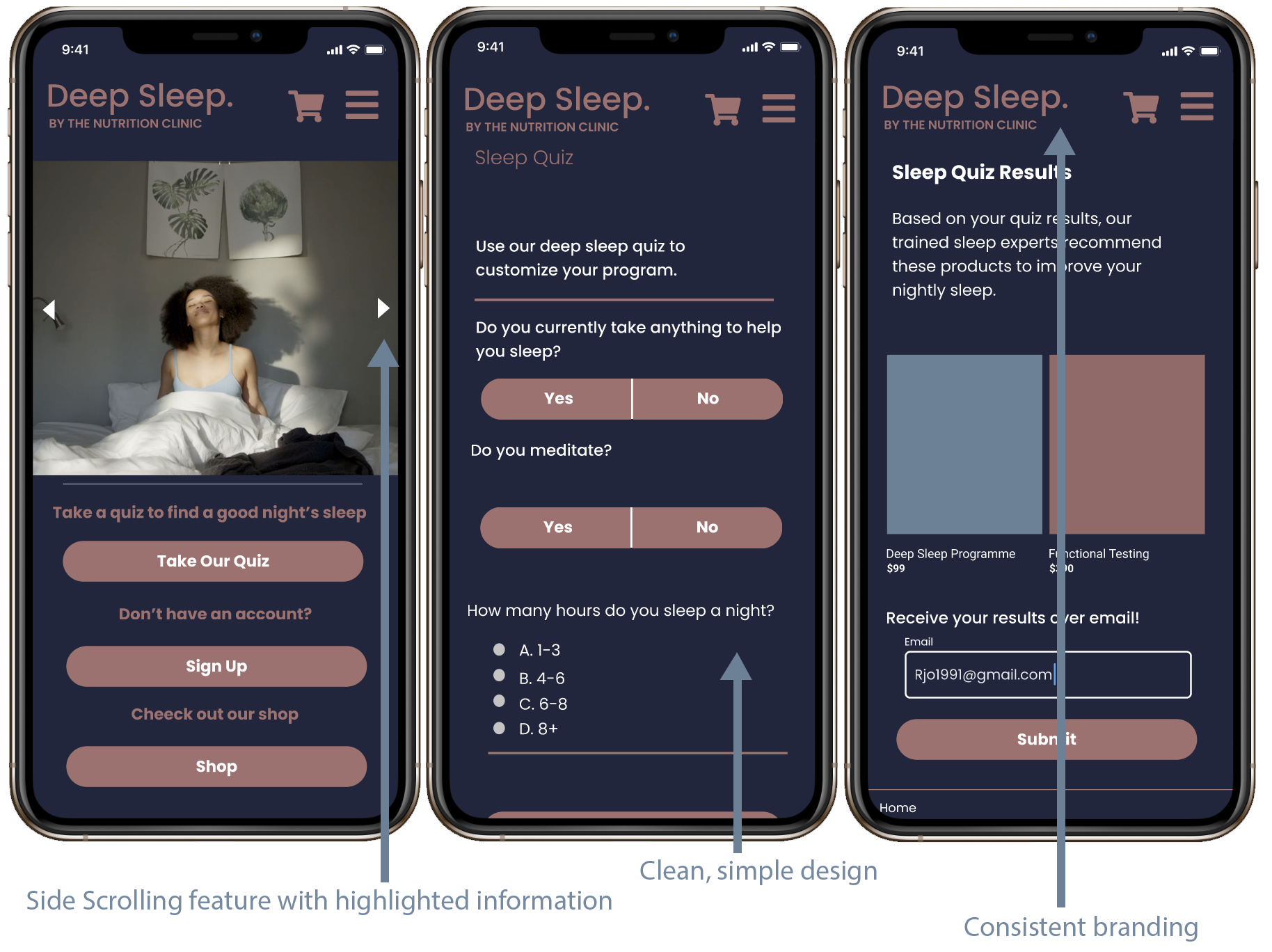
Nutrition Clinic's Deep Sleep Program Website
Background
The Nutrition Clinc, a Singapore-based company, is lauching a new program called Deep Sleep. Deep Sleep is a scientific and evidence-based program created to improve sleep quality with optional add ons: A selection of curated luxury sleep ritual products, sleep supplements, and tests. “We connect the art and science of a good night’s sleep.”
Goal
To create a web-based interactive experience for Nutrition Clinic’s new “Deep Sleep” program.
My Role
I conducted user research related to potential U.S. users, then worked on user product design and evaluation. I coordinated with a team of three other UX/UI researcher/designers.
Nutrition Clinic representatives provided Singapore-based research, including competative analysis research, user research (Singapore User Personas), style guide and moodboard.
My UX/UI Contribution:
- Research
- Analysis
- Ideation
- Information Architecture
- Evaluation
- Iteration
The Problem
How might we create a seamless and responsive experience to improve sleep?
The solution
We expolred the needs of users with poor sleep in the U.S. by conducting primary and secondary research. We designed a web-based app prototype for the Deep Sleep product offerings based on our findings, as well as the findings of the Nutrition Clinic research and design team. We then conducted initial user testing to determine prototype design next steps.
Research
The Nutrition Clinic team provided our U.S. team of four with user research on Singapore users and potetial clients including Singapore survey results, personas, style guide,and mood board.
secondary Research
Our U.S. design team each researched sleep and spa product competitors, using heuristic analysis categories Consistency and Standards, User Control and Recognition, Flexibility of Use, and Asthetic and Minimalisitic Design. Due to our time constraints, only four Heuristic Pricipals were analyzed. The competitors evaluated were: Calm App (a popular meditation app), Sleepio Web-Based Program/App, Therabox (a sleep/spa monthly subscription service) and Six Senses Sleep Treatment (resort-based sleep and spa programs).
User Survey
The team issued a survey to learn about international users with sleep issues. Surveys aimed to reach users between the ages of 20-40 with sleap issues intersted in using sleep products.
Interviews
We then conducted four interviews with users who fit the Deep Sleep potential user profile.
Questions included:
- What does your current night routine look like prior to sleeping?
- Describe to me a time you had the best night’s sleep.
- Describe to me a time you had the worst night’s sleep.
- Tell me about a time you have used something to help you sleep.
- Is there something you wish you had or wish you tried to improve your sleep?
Affinity Map
We then compiled an affinity map pulling together user interview comments and thoughts.
Categories included:
- Reasons for bad sleep
- Sleep solutions-actions
- Sleep solutions-products
U.S. Based User Persona
One U.S. design team member used the primary and secondary U.S. research to create a U.S. based user persona, highlighting the main pain points and goals of the users we interviewed.
App Features
Based on the user's identified pain points and goals we created a list of Deep Sleep App potential features. As we brainstormed, we created a list of app feature questions for our Nutrition Clinic client representatives. Following this, we designed a user journey, outlining the path the user would take to navigate through the app. The initial user journey concept included a landing page, followed by either a sleep quiz or an about page, and then on to a sign up page.
User flow
We took the user journey and one team member created two user flows. We then determined the flow we wanted to test with users: the user quiz taking and shopping experiences.
Deep Sleep Site Map
sketches
Our team of four collaborated on sketches for potential app designs. Each team member participated in a crazy eight exercise where each designer took one minute per sketch for a total of eight sketches to flush out ideas. My designs are displayed below, including ideas for product screen layouts, onboarding screens, program calendar selection, and a features screen.
style Guide: Color Palette
We used the calm, soothing color palette provided by the Nutrition Clinic representatives for the web-based app text colors, calls action and other design elements. We collectively decided to use a deep blue/purple background to mimic night and reference sleep.
style Guide: Mood Board
We used the mood board provided by the Nutrition Clinic representatives for the overall feel and look of the web-based app.
Initial Prototype
U.S. design team members created the initial web-based app prototype based on the brainstormed sketches and user journey and user flows. I contributed to design prototype brainstorming and several app screens related to consultation scheduling and calendar sign up.
User Testing
We conducted user testing to determine the app's usability, focusing on three main goals:
- How do users navigate the app and understand it's main features
- Do users understand the sleep quiz
- Can users add products to the cart
User Feedback
- The User wanted more scientific information for products
- The User did not want to provide her email without more evidence the products were ones she should buy
- The User opted to bypass the quiz and go straight for the sign up option
The Deep Sleep Website/App: Final Thoughts and Next Steps
Given the short project time frame, the U.S. design team was only able to complete one prototype iteration. Based on user feedback, the designers would next add a wand to the shopping cart to give the user feedback the cart is filled, provide user feedback with nutrition facts after each quiz question answered, and offer more scientific product information to promote user trust in the brand and product offerings.


